In short
- Problem
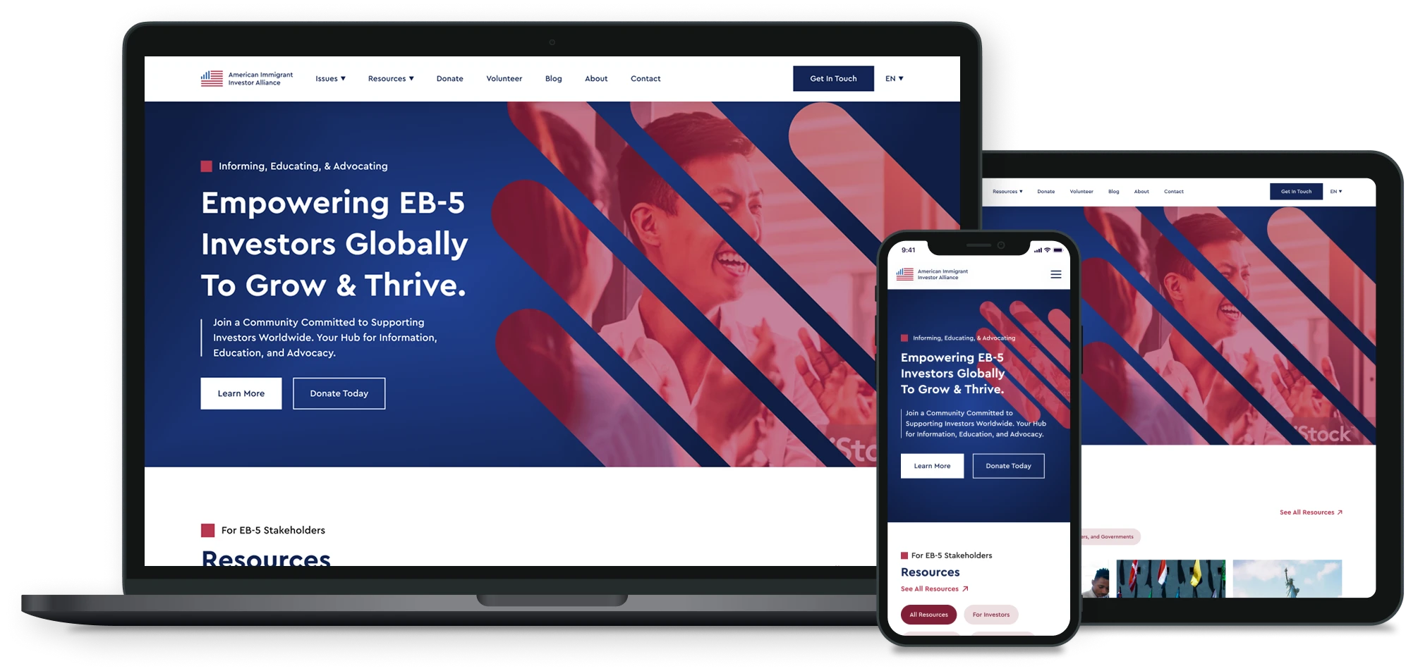
- Three audiences with very different questions shared one site organised around AIIA’s internal topics. Every visitor had to work out where their content lived.
- Opportunity
- AIIA’s guides and advocacy updates were its strongest asset. Routing each audience to them quickly would turn a brochure into a reference people come back to.
- What I did
- A content audit of 50+ pages, a new information architecture by audience and by issue, 10+ developer-ready responsive pages in Figma, and the WordPress migration.
- Outcome
- 16.3K visits a month, 2.39 pages per visit and a 2:21 average visit, against competitor averages of 12.0K, 1.82 and 1:15.
- Proudest decision
- Letting visitors say who they are, instead of making them decode a menu.
01 / Context and constraints
One site, three first questions.
AIIA is run by investors for investors. Its readers are global, from China, Vietnam, India and beyond, and many read English as a second language.
- Three audiences, three different first questions. A prospective investor asks “Is EB-5 right for me, and how does it work?” An existing investor asks “Why is my case delayed, and what happens to my money?” A developer asks “How do I raise EB-5 capital?”
- A library that couldn’t be lost. 50+ pages of guides, issue updates and blog posts had to survive the move with their structure and links intact.
- An advocacy organisation, not a sales site. There is no product to sell. Success means membership, donations, newsletter sign-ups and investors who come back.
- Three languages. The site runs in English, Chinese and Vietnamese, so every template had to hold longer and shorter text without breaking.
- Staff publish after launch. Every page had to be editable in WordPress by people who aren’t designers.
02 / What research told me
Every page, read as its audience.
I audited every page on the old site: who it was written for, which issue it covered, whether it was current, and where it sat in the navigation.
50+pages read as their audience, then kept, merged, rewritten or retired.
Finding 1Investor guides and developer guides sat side by side in the same menus, so each audience had to read past content meant for someone else.
Finding 2Advocacy updates on delays, backlogs and litigation lived in dated blog posts, so the topics investors cared about most had no permanent home.
Finding 3Several guides overlapped or were out of date, so migrating them as they were would carry the clutter into the new site.
Finding 4Membership, donation and newsletter asks competed on the same pages, so no audience had one clear next step.
03 / Key design decisions
Four decisions that shaped the site.
01Let visitors say who they are
- Context
- A topic menu forces every visitor to translate their situation into AIIA’s categories.
- Options
- A — keep the topic menu and add audience landing pages
- B — a separate microsite per audience
- C — one site, with audience filters on the resource library and a homepage helper that asks who you are and what you need
- Choice
- C. Resources filter by EB-5 Investors or by Developers, Business Owners and Governments. Visitors who still can’t find a guide answer two questions, “I am a…” (potential investor, project developer or sponsor, existing investor) and “I need…”, and go straight to it.
- Why
- Visitors know who they are before they know what a page is called. Shared content is written once and surfaced to whoever needs it.
- Trade-off
- Some guides belong to more than one audience, so tagging has to be maintained.
- Evidence
- Visitors view 2.39 pages per visit, more than on four of the five competing sites, which suggests they find a next page worth opening.
02Give each issue a permanent home
- Context
- AIIA’s advocacy covers processing delays, the visa backlog, FOIA data, government litigation, reauthorization, redeployment and repayment. These lived in dated blog posts.
- Options
- A — keep issues as blog categories
- B — issue pages grouped into three areas (EB-5 Policy & Oversight, Immigration, and Investment & Securities), each gathering its guides, news and posts
- Choice
- B, with one Featured Issue on the homepage, currently Processing Delays.
- Why
- Investors follow an issue for years, not a post for a day. An issue page explains the problem once and collects every update under it, so a new reader can catch up in one place.
- Trade-off
- Someone has to choose the featured issue and keep each issue’s introduction current.
- Context
- 50+ pages were moving to WordPress.
- Options
- A — migrate everything as it was and clean up later
- B — use the audit to keep, merge, rewrite or retire every page first
- Choice
- B.
- Why
- A migration is the cheapest moment to clean up. The new structure started tidy, and redirects sent every old URL to its new home, so search traffic and shared links kept working.
- Trade-off
- A slower migration, and harder conversations about retiring content people had written.
04Templates the staff can carry
- Context
- AIIA’s staff publish after launch, in three languages.
- Options
- A — a bespoke design for every page
- B — a small set of responsive templates, one per content type: guide, issue, blog post, membership and directory
- Choice
- B, across the 10+ pages I designed.
- Why
- Editors can publish without breaking layouts, and translated pages inherit the same structure.
- Trade-off
- Less visual variety between pages.
04 / Outcomes
Where the site stands against its peers.
16.3Kvisits a month, 35% above the competitor average of 12.0K
2.39pages per visit, against an average of 1.82
2:21average visit, nearly twice the average of 1:15
50+pages migrated with their structure and links intact
Third-party traffic estimates for one month, against five competing EB-5 sites:
| Site | Visits | Avg. visit | Pages per visit | Bounce rate |
|---|
| AIIA (goaiia.org) | 16.3K | 2:21 | 2.39 | 44.64% |
|---|
| eb5visainvestments.com | 26.1K | 0:24 | 1.59 | 53.64% |
|---|
| eb5united.com | 17.94K | 2:27 | 2.37 | 45.61% |
|---|
| iiusa.org | 13.26K | 3:21 | 2.79 | 42.95% |
|---|
| eb5diligence.com | 1.69K | 0:02 | 1.26 | 36.38% |
|---|
| eb5marketplace.com | 1.24K | 0:00 | 1.07 | 38.58% |
|---|
| Competitor average | 12.0K | 1:15 | 1.82 | 43.43% |
|---|
Source: third-party traffic estimates, one month.
AIIA draws 35% more visits than the competitor average, and its visitors stay nearly twice as long and view 32% more pages. IIUSA, the strongest peer, gets fewer visits, but its visitors read more per visit. That is the bar for the next round. AIIA’s bounce rate sits at the average, so I don’t claim a bounce-rate win.
05 / What I would do differently
What I would do differently.
Set a baseline before launch
Without before-and-after data from the old site, I can show where AIIA stands but not how far it moved.
Tree-test the audience paths
Five people per audience, before the migration, would have tested the structure with real investors instead of only my audit.
Measure the next step, not only traffic
I’d track membership sign-ups, donations and newsletter sign-ups per audience from day one.
Make one ask, not three
The homepage asks for a newsletter sign-up three times. One well-placed ask per audience would be stronger.