EB5 Resources: designing for a decision families make once
An EB-5 advisory founded by a former investor. Its clients are deciding whether to put $800,000 or more of their family’s money into a US project in exchange for a green card.
+1,381.6%direct new users, with organic social traffic up 493.8%
Role
Product designer; owned the website from research to developer handoff
Team
Supercharged Studio (brand, design, development)
Timeline
Shipped 2025
Context
Client project, shipped
EB5 Resources is an EB-5 advisory founded by a former EB-5 investor. At Supercharged Studio, I designed the new website around the questions those investors ask, in the order they ask them. After launch, active users grew 76.3% to 11K.
In short
Problem
EB-5 investors are deciding whether to put a large share of their family’s wealth into a US project. Most sites in the category bury that decision under legal jargon, service lists and stock imagery.
Opportunity
The founder had made the same investment himself. A site that answered investors’ questions plainly, in his voice, could be the most trustworthy in the category.
What I did
Within a studio team that also rebranded the company, I owned the website: research, content structure, information architecture, wireframes, UI and developer handoff.
Outcome
After launch, active users rose 76.3% to 11K, new users rose 76.8% year over year, direct new users rose 1,381.6%, and organic social traffic rose 493.8%.
Proudest decision
Organising the site around the investor’s journey instead of the firm’s services.
01 / Context and constraints
Nobody makes this decision on impulse.
A once-in-a-lifetime decision. The minimum investment is $800,000 in a targeted employment area or rural project, and $1,050,000 elsewhere, followed by years of waiting.
Securities rules. Investments are offered through a FINRA-registered broker-dealer. The site can describe projects, but it can’t promise returns, and the disclosures have to stay visible.
A global audience. Clients range from H-1B holders already in California to families abroad, often reading in a second language.
A small team publishing. After launch, the client adds projects and articles in Webflow without a designer.
02 / What research told me
Every competitor led with itself.
I combined a competitor analysis of EB-5 advisory and regional-centre sites, secondary research on what investors ask before they commit, and working sessions with the founder.
Pattern 1
Competitors lead with the firm and its services. Investors arrive with questions: is it safe, how long does it take, what happens to my money.
Pattern 2
Project information is marketing copy, not comparable facts. The thing investors compare most is the hardest to compare.
Pattern 3
Educational content sits in a blog nobody is routed to, so the firm’s best credibility asset is hidden.
Pattern 4
Investors ask the same questions again and again: cost, timeline, risk, who is involved. Those answers belong on the homepage, not in a sales call.
03 / Key design decisions
Four decisions that shaped the site.
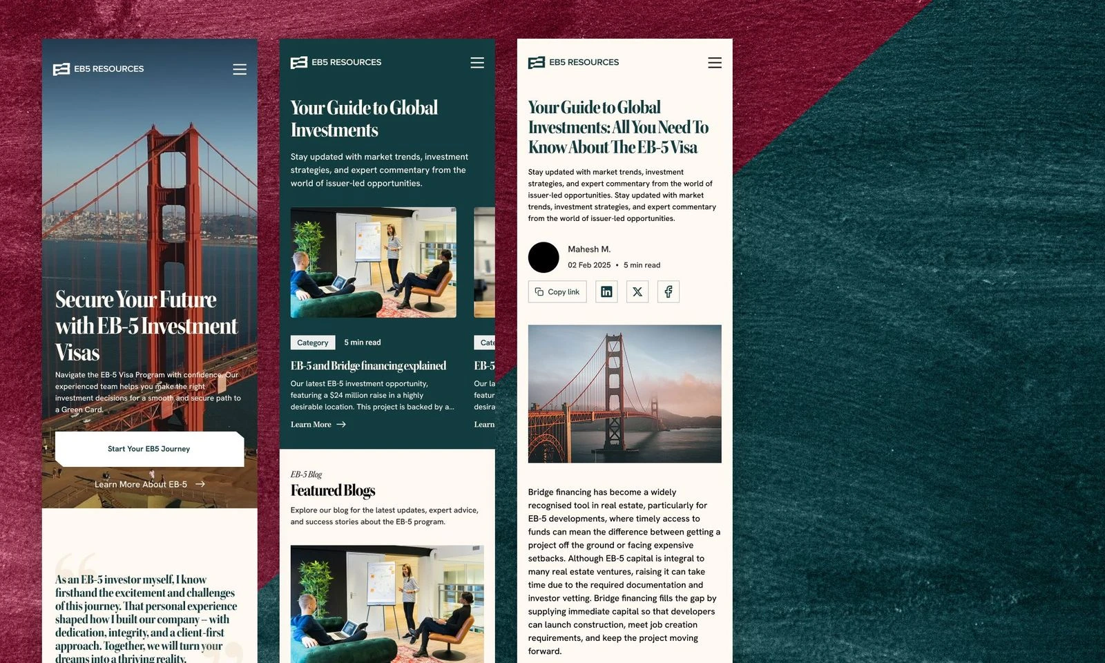
The same journey on a phone: understand, compare, read, then call.The same journey on a phone: understand, compare, read, then call.The same journey on a phone: understand, compare, read, then call.
01
Structure the site around the investor’s journey, not the firm’s services
Context
Most competitors are organised as a list of services.
Options
A — navigation by service
B — navigation by visa type and process step
C — navigation in the order an investor moves: understand EB-5, see how the firm helps, evaluate projects, keep learning, then talk to an advisor
Choice
C. The main navigation reads What Is EB-5, Our Services, Active Investments, Blog & News, Get In Touch.
Why
An investor’s first visit is about understanding, the second about comparing, and the third about trusting someone enough to call. Each stage needs its own page, and each page needs one clear next step, which is always “Start your EB-5 journey”.
Trade-off
The eight services became cards on one page instead of eight pages in the navigation, so each service gets less space.
02
Turn project listings into something investors can compare
Context
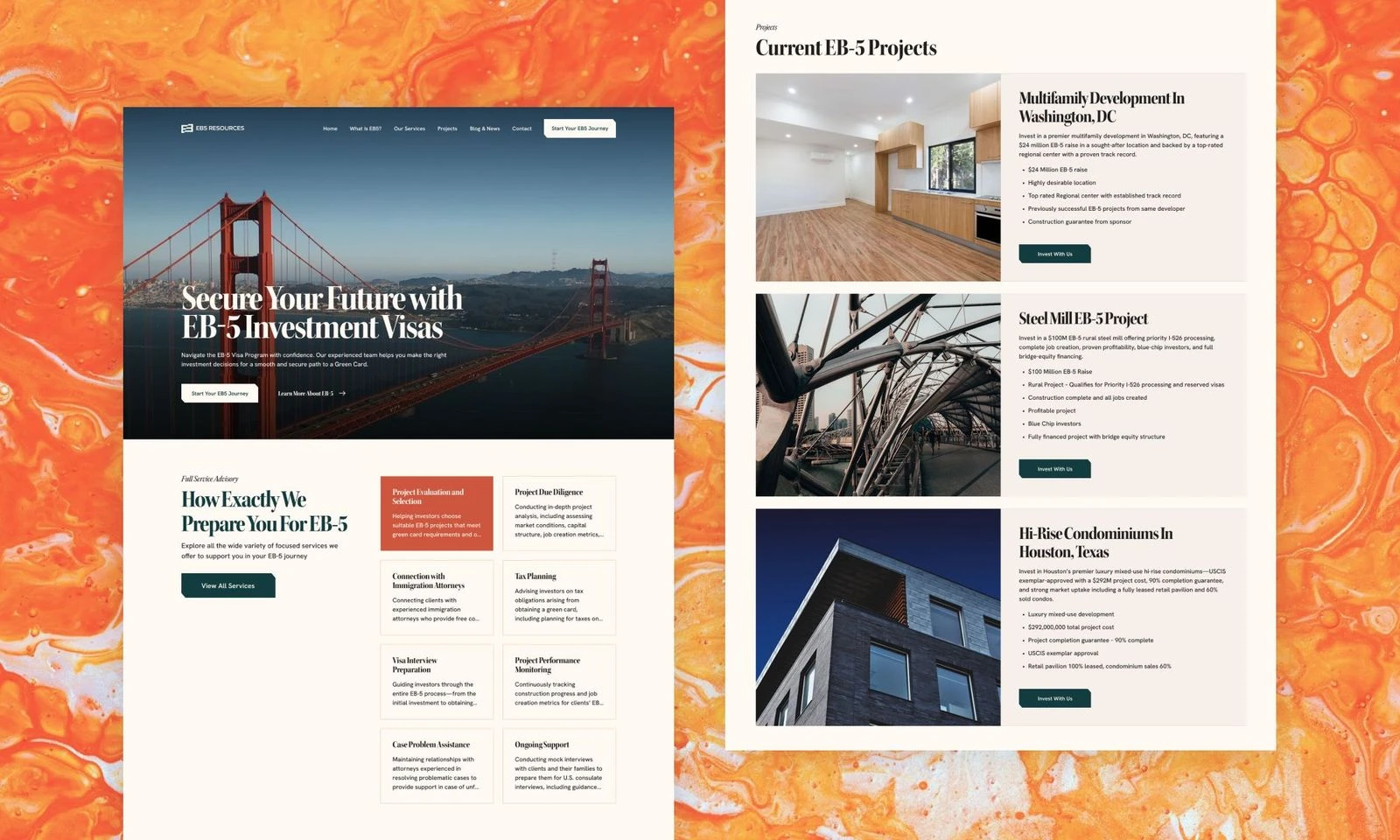
The Active Investments page lists real projects: a Class A office in Boca Raton, a hotel and condos in Deer Valley, Utah, a master-planned community in San Diego. For an investor, this page is the decision.
Options
A — image-led cards with a name and location
B — a detail page per project with no summary
C — cards that put the same facts in the same place on every project, with the detail one tap away
Choice
C. Every card shows location, project type, targeted-employment or rural status, approval and construction status, and one proof point, such as jobs created or the sponsor’s backing.
Why
Consistent fields let investors compare without reading every page. Consistency also signals honesty: nothing is shown on one project and hidden on another.
Trade-off
Less room on each card for the project’s story, and every field has to pass compliance review before it goes live.
03
Put education at the front door
Context
Investors research for months before contacting anyone, and the firm already had real expertise, in articles such as the total cost of an EB-5 visa and the 2026 grandfathering deadline.
Options
A — a blog behind a nav link only
B — featured articles on the homepage only
C — both: a “Blog & News” link in the main navigation and a Blog section on the homepage
Choice
C.
Why
The two doors serve different readers. The nav link gives an investor with a specific question a permanent place to browse. The homepage section puts articles in front of the investor who hasn’t yet worked out what to ask. Useful answers are how a careful investor decides a firm is credible.
Trade-off
Two places to keep current, and a longer homepage. The client has to publish regularly, or a stale Blog section undermines the credibility it was meant to build.
04
Let the founder’s own investment do the talking
Context
In a category of faceless firms, the strongest trust asset was that the founder had invested in EB-5 himself and earned his green card that way.
Options
A — a standard About page
B — testimonials only
C — the founder on the homepage twice, with a short message near the top and a “Meet Ashok” section before the closing call to action, alongside client testimonials
Choice
C.
Why
Investors trust someone who has taken the same risk with his own family’s money. His story answers “why should I believe you?” before the investor asks it.
Trade-off
The brand leans on one person. As the firm grows, the story has to grow beyond him.
04 / Outcomes
What moved after launch.
11Kactive users after launch, up 76.3%
+76.8%new users, year over year
+1,381.6%direct new users
+493.8%organic social traffic
Active Investments: the one page an investor reads twice.
After launch, compared with the previous year:
Metric
Change
Active users
+76.3%, to 11K
New users
+76.8%
Direct new users
+1,381.6%
Organic social traffic
+493.8%
Source: the client’s analytics, measured against the year before launch.
This was a team result: the rebrand, the content and the site launched together, so I can’t isolate the site’s share. The biggest gains were in direct and organic social traffic, which is where a clearer site and front-door content should show up first.
05 / What I would do differently
What I would do differently.
Measure the funnel, not only traffic
I’d track consultation requests from launch day, so the outcome is “more qualified conversations”, not just more visitors.
Talk to real investors
The research was competitor analysis, secondary research and the founder’s view. Five calls with past clients would have tested the journey structure directly.
Source every number on the page
Claims like client satisfaction and jobs created need a visible source. For an audience this cautious, an unsourced number costs more trust than it earns.