Case study / Website design
Optimity
Driving B2B growth for a health, wellness, and insurance startup.
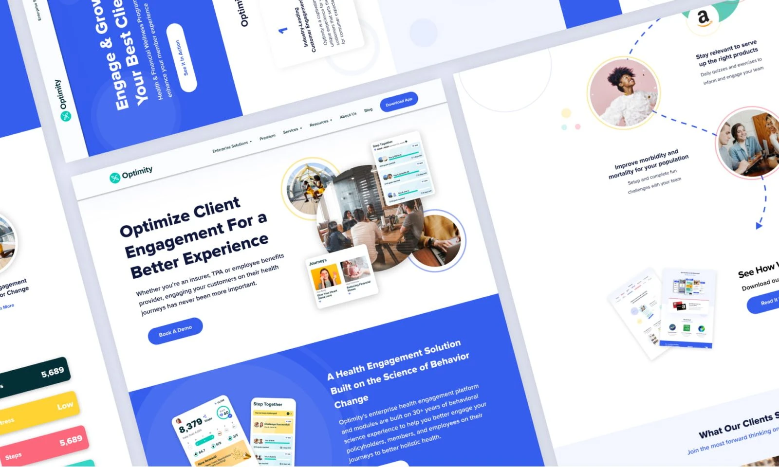
Discover how we created a visually captivating and user-friendly website that helped Optimity achieve a stronghold in the health, wellness & insuretech industry driving B2B growth.
01 / About the client
Healthier, wealthier and longer, one lesson at a time.
Optimity is a micro-learning app that helps millions of people live healthier, wealthier, and longer. If you're looking to improve your health and wellness, it's essential that you get the information you need, personalized to your specific lifestyle and habits. Optimity does just that by taking data from your wearables and combining it with information from your lifestyle, to provide actionable insights. As a result, this system can help improve your health and improve your quality of life.
Our team was delighted to be given the opportunity to create a website that showcases Optimity's brand and value proposition, helping to bring in new B2B clients.
02 / Project goals and requirements
Nail the brand, sell the USP, land B2B clients.
We were tasked with creating a website that nails Optimity's branding, brings out its USP, and helps it land new B2B clients. Our primary objective was to collaborate with Optimity and contribute to their B2B growth by developing supplementary webpages. Throughout this project, we crafted an array of desktop and mobile webpages, that included:
Homepage
Enterprise Landing Page
Health Grade Product Page
Insurance Page
Our overarching aim was to present Optimity's product offerings in a clear and compelling manner, emphasizing their potential advantages across various B2B sectors they were targeting. By effectively showcasing these benefits, we endeavored to enhance Optimity's market presence and facilitate their growth in the industry.
03 / Project team
Four people, one website.
- Design LeadNivit Kochhar
- UI DesignerMahesh Reddythat's me
- Marketing & CopyJulie Spugnardi
- DevelopmentNikola Tripkovic
04 / Brand guidelines
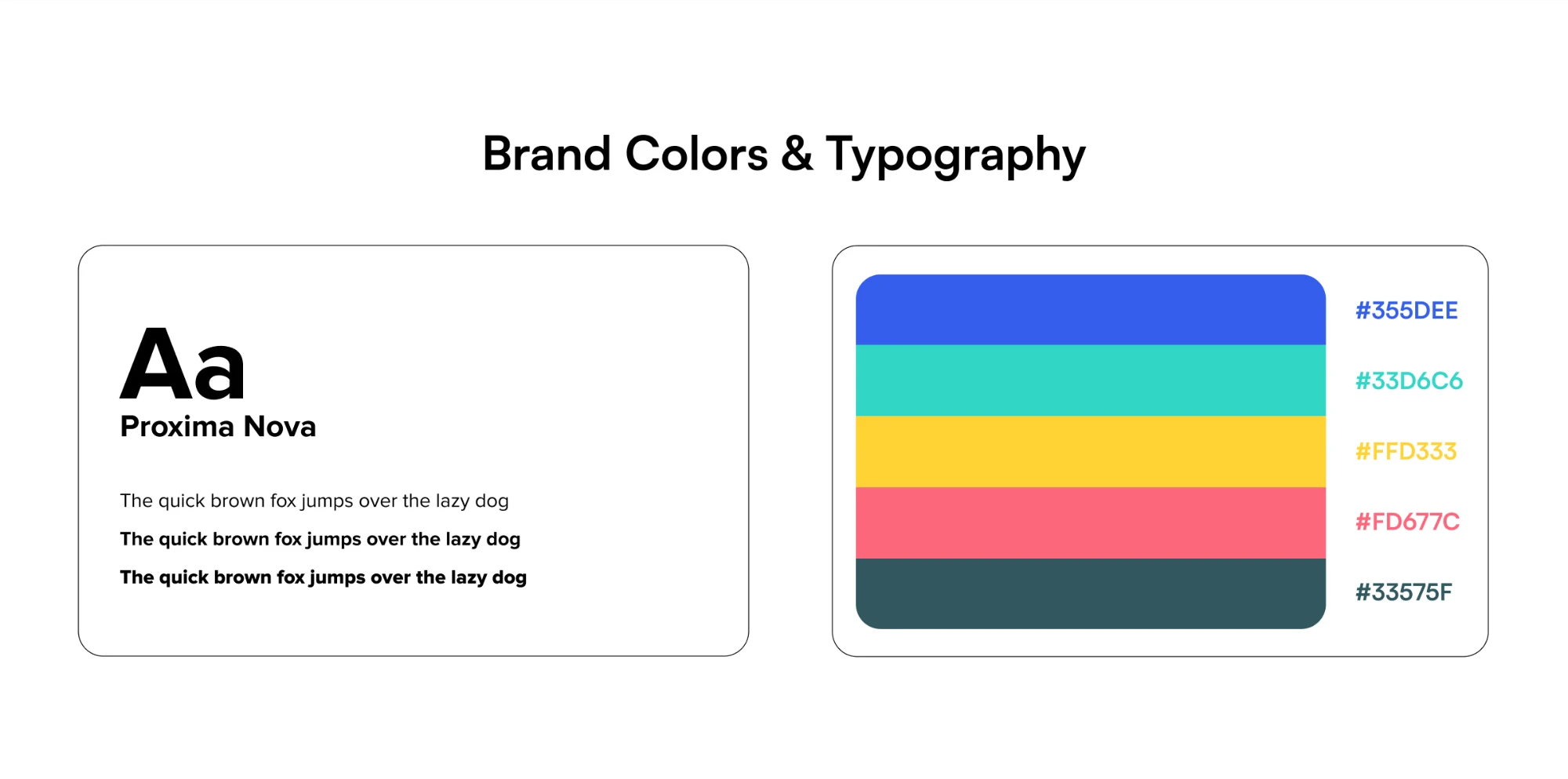
Start from the brand they already had.
Prior to initiating the design process, we conducted an extensive review of Optimity's established brand guidelines. Our objective was to ensure that our designs aligned seamlessly with their existing branding and overarching vision. By carefully studying these guidelines, we aimed to create designs that were in perfect harmony with Optimity's brand identity and effectively communicated their vision.
05 / Wireframes and planning
Hierarchy first, colour later.
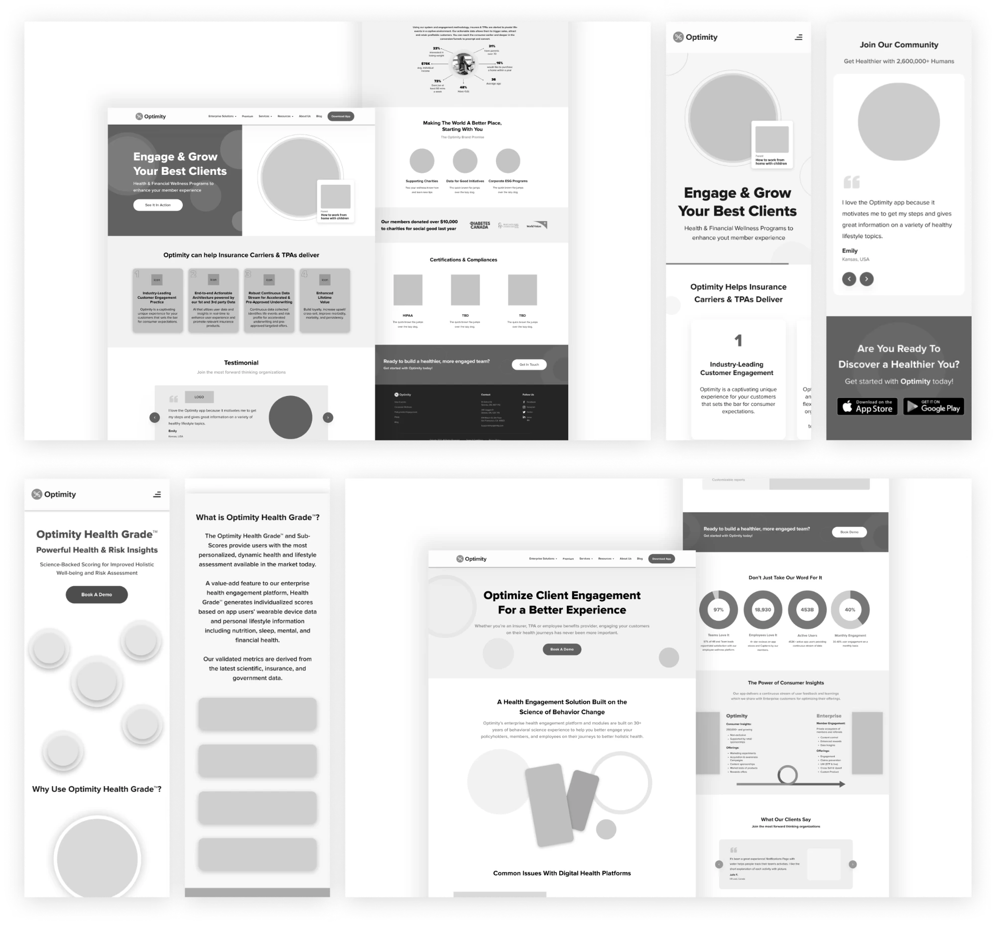
During the Wireframing & Planning stage, we initiated the process with initial sketches and wireframes for each webpage. Subsequently, we engaged in comprehensive discussions pertaining to information hierarchy and layout decisions.
To give you a glimpse of this initial planning stage, we have included some visuals below.
06 / Design system
One set of parts for every page.
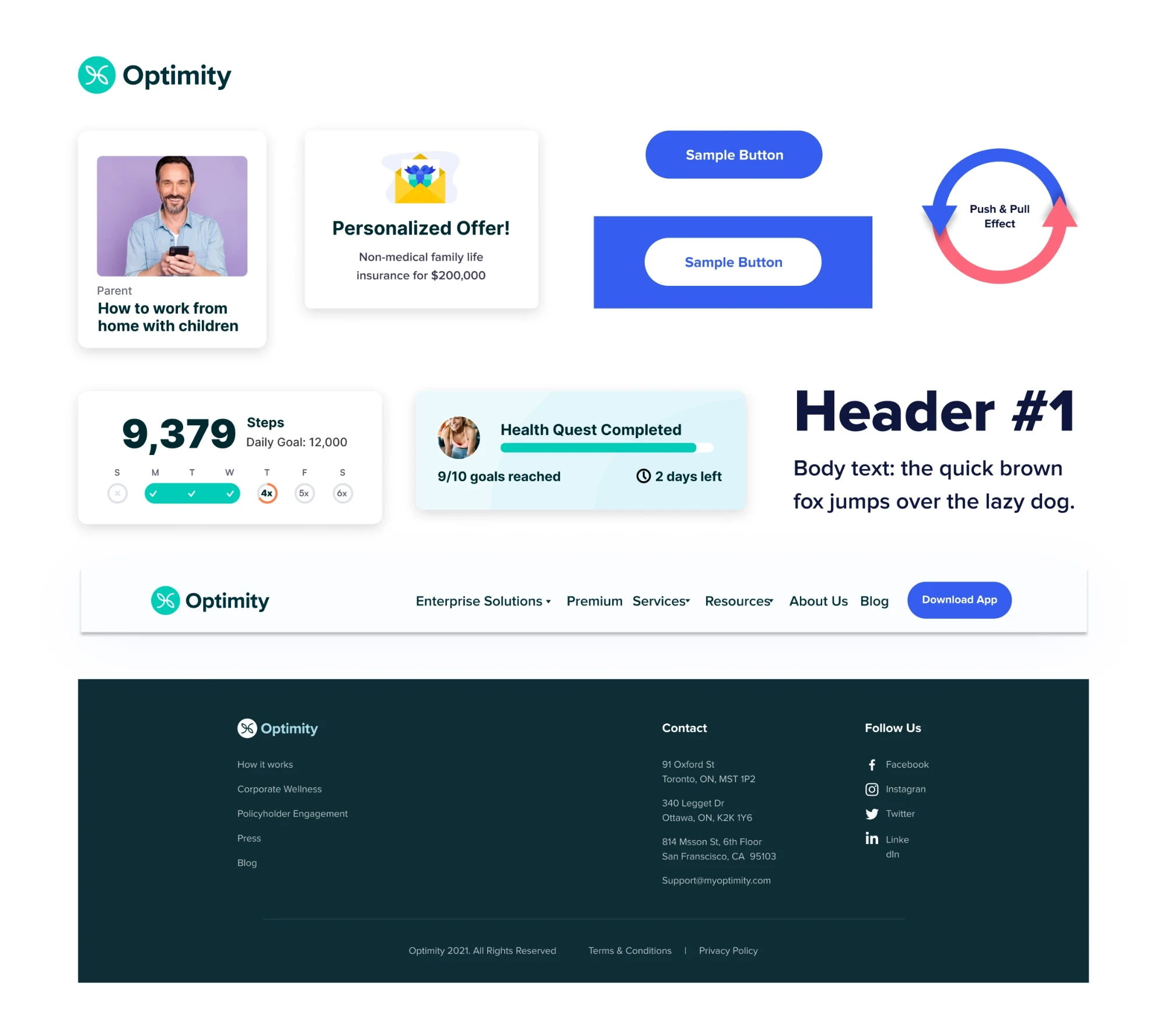
As part of our project, we used the spark method, a comprehensive design system that we created specifically for this project. This involved developing a set of consistent design elements, such as typography, colour palettes, and button styles, that would be applied consistently across all webpages. By establishing a cohesive design system, we aimed to ensure visual harmony, improve user experience, and facilitate efficient collaboration throughout the project.
This design system served as a foundation for maintaining brand consistency and providing a polished and cohesive UI for this next stage of Optimity's B2B web presence.
07 / Visual design and mockups
From grey boxes to the finished look.
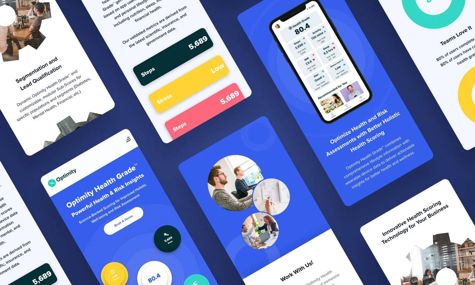
During the mockups and visual design phase of the project, we transitioned from the conceptual stage to the creation of polished and visually captivating designs. Building upon the wireframes and design system, we meticulously crafted high-fidelity mockups that showcased the final look and feel of each webpage.
Using our design system, we aimed to create visually compelling and engaging designs that aligned seamlessly with Optimity's brand identity. This phase allowed us to bring the project to life visually, ensuring that the end product would not only be visually appealing but also functional and user-friendly.
08 / Development and guidelines
Built in Webflow, true to the file.
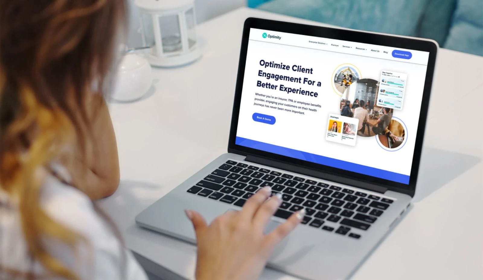
During the development phase of the project, we established a valuable collaboration with Nikola, our trusted development partner who specializes in Webflow implementation. Working closely with Nikola, we seamlessly executed the implementation of the webpages.
Leveraging their expertise and technical proficiency, Nikola played a pivotal role in transforming the design assets and specifications into a fully functional and visually stunning website.
Below are some visuals of the live website in action.
09 / Results and concluding remarks
People stayed.
Bounce rate. Lower is better.
We are proud to have played a role in enhancing Optimity's market presence and facilitating their growth in the industry. By crafting a website that effectively communicates Optimity's brand and value proposition, we have contributed to their mission of helping millions of people live healthier, wealthier, and longer lives.
The results speak for themselves as Optimity's new website boasts an impressive bounce rate of 55%, a significant achievement that sets them apart from competitors in the market. This 15% lower bounce rate compared to their competitors' rate of 70% showcases the website's effectiveness in retaining audience attention and fostering more interactions. We look forward to witnessing Optimity's continued success in the B2B sector and are grateful for the opportunity to have been part of their journey.
Thank you for reading! :)